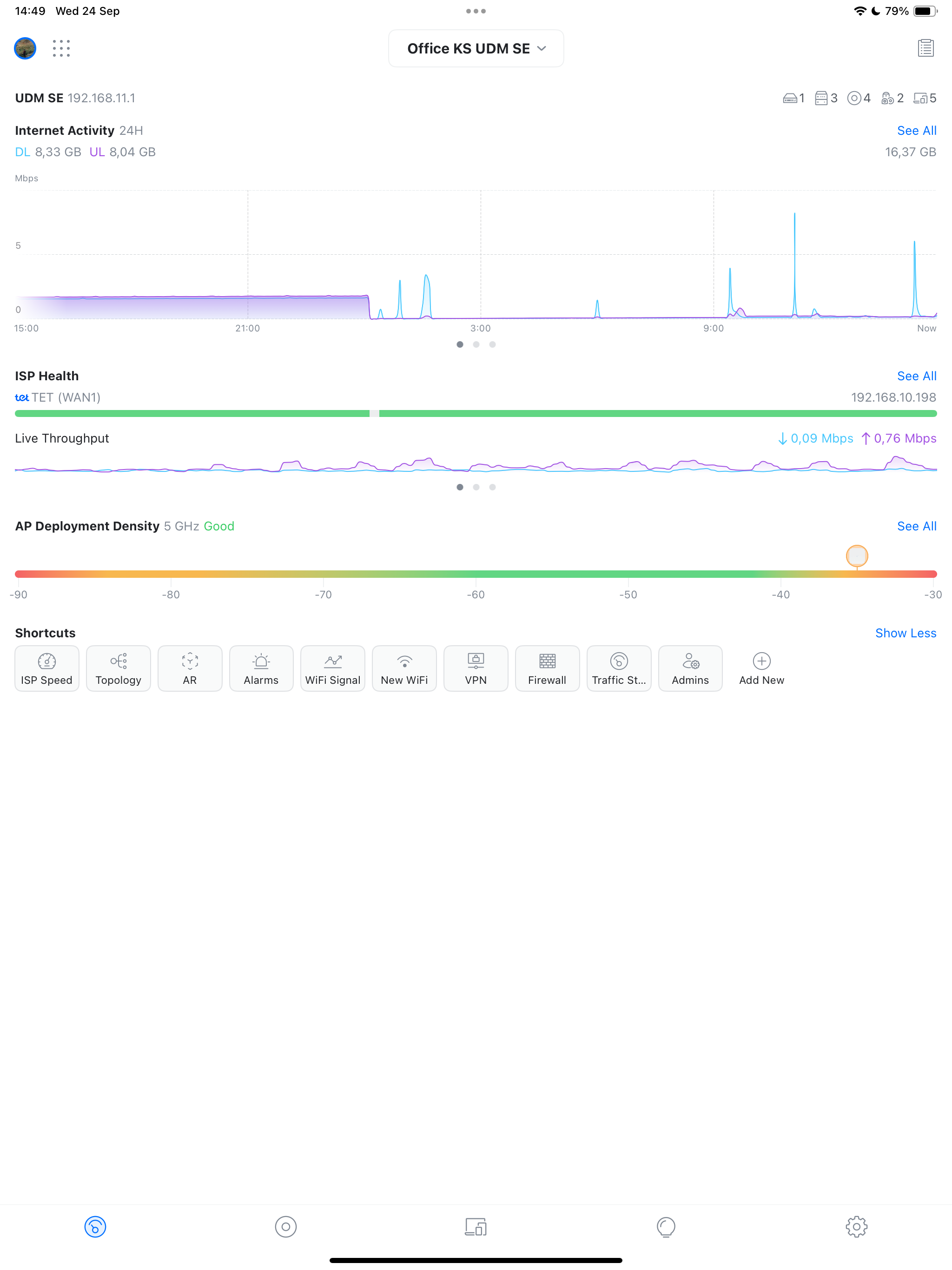
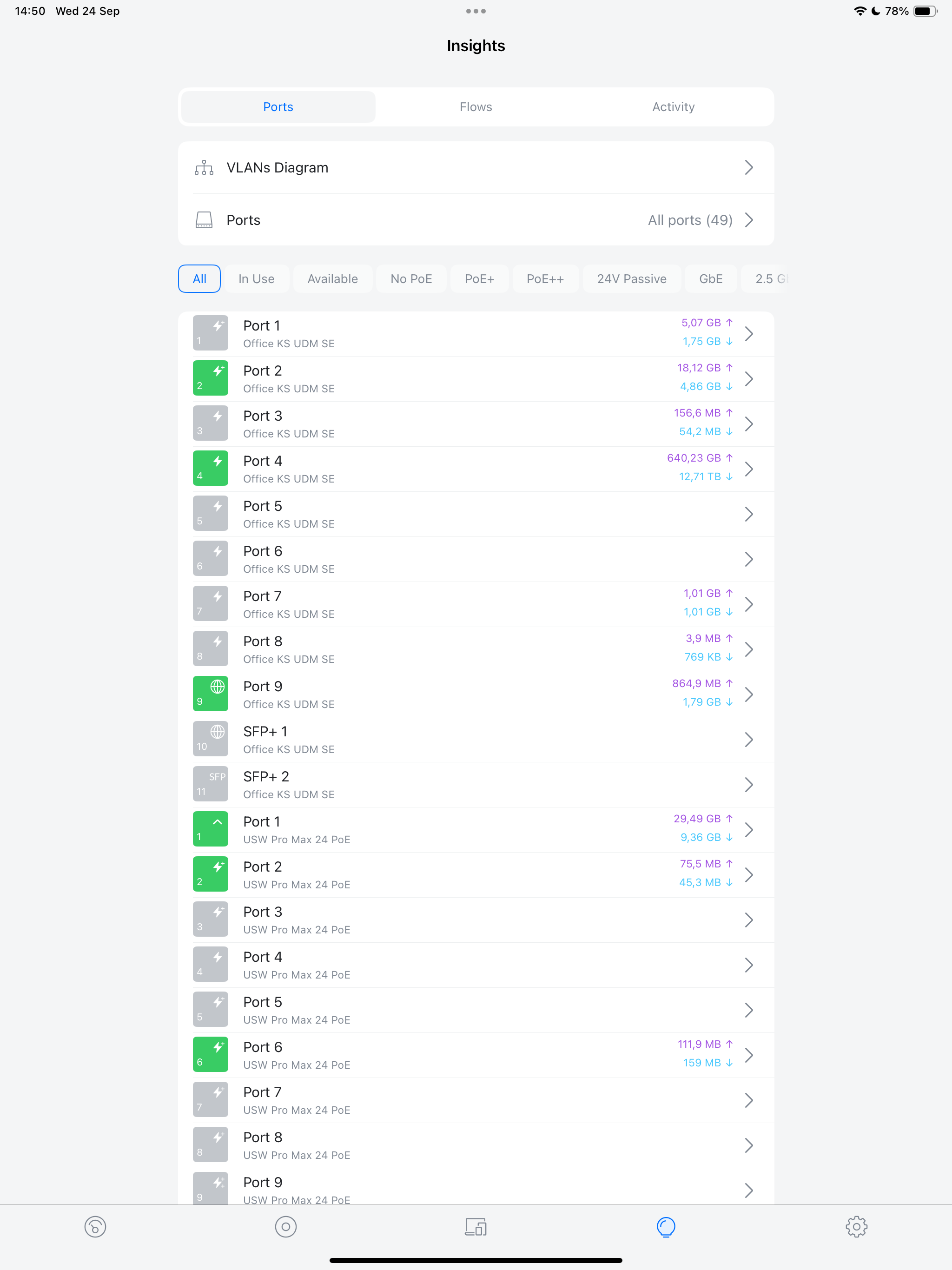
Whilst the device icons are a nice touch it’s simply not practical and makes the client overview screen look both messy and unprofessional. Features like this only work if you can confidently cover 100% of the devices and ensure that the library of images accurately reflects the model/version. The fact that a Ubiquiti TouchSwitch has an Apple TV icon is reason enough to abandon this feature.
- There’s no need for the wireless score to be listed in a different font size/bold on the devices & client overview screen. On the client screen there’s now what appears to be 4 different font sizes for each row.
- On the client overview screen why is it necessary to see the device name, throughout, wireless quality score, frequency, access point name, wireless network name /w signal icon and power saving status in such a small space?
- The device icons can’t be hidden or changed to generic icons in the display settings.
Developer replied on Aug 17, 2019
Hey, thanks for the review! Hopefully this will address some your concerns.
- You will be able to change the client icons from the web interface in controller v5.11 (currently release candidate, so should be released soon), and it will be reflected in the app as well. This will also improve our logic for automatically recognizing the type of the device, so it should get better over time.
- The wireless/wired experience score should be the same font as the name of the device.
- You may disable the additional connection info in the client list "Display Options" menu (from the list, tap on the three dots in the top left). Many of our users actually like to know a lot about their clients directly in the list, so we kept it that way mainly because that's how it was before, but we agree that it can get a bit overwhelming so we added the option to hide it.


