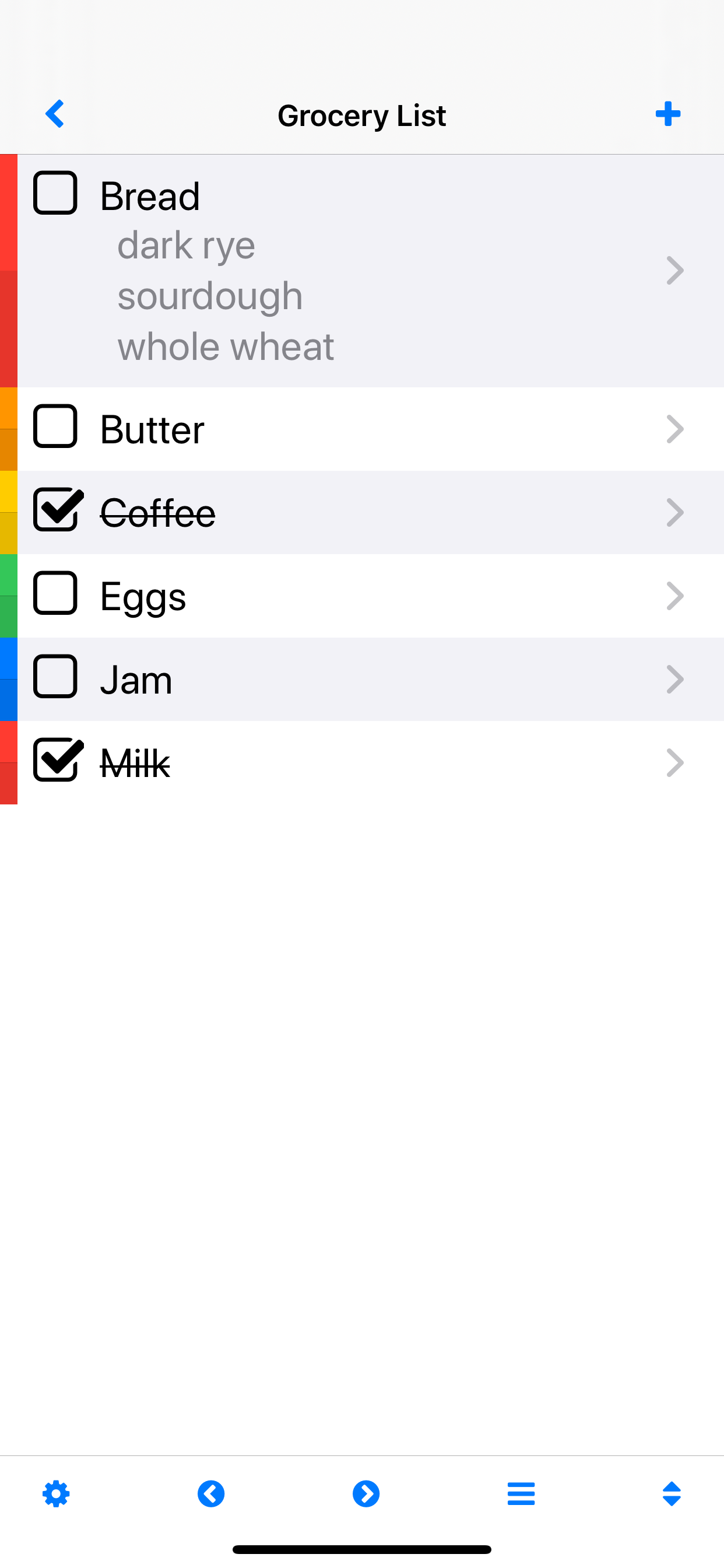
Can some one tell me why you would remove an option when it works fine the way it is??? I use this app a lot, and I really like it. I use the "lower checked items" option on just about every single list I create. Why would you remove this? It doesn't make any sense - it works perfectly. If someone doesn't want/need it, they don't have to use it. But, WHY take away something that is a very nice feature that works perfectly. I haven't installed the latest update because I do not want this feature removed. Who wants to sort through a list that mixes complete/incomplete items in a hodgepodge fashion? I rarely write reviews, but felt obligated here. Before this latest update, I would give this app 4.5-5 stars. This one deletion alone drops my ranking to 3 stars. For those of us who want an organized appearing list, this is a step backward. And honestly, I think that anyone who would pay for a list making app feels the same way - we want to be efficiently organized. Fix this, and I will update my review to 5 stars.
**Update: first off, “lower checked items” has been returned. Thank you. Thank you.
But, now I have to remove one star. The last ‘upgrade’ had 2 features that I, as a VERY long-term user, find frustrating. The layout was changed to make the font smaller and less bold. It makes it a bit harder to read easily. I’m sure they did it to allow more info on the screen at once, but I find it MUCH LESS easy on the eyes now. Worse yet, as we are all getting older, we should have the option of making the font bigger if we want, not FORCED to have it smaller. Big step back. Should’ve just added an option to change font size if wanted. Maybe I will get used to it... and I’m sure it is fine for New Users, but for people that have been using this for 5+ years, it is - all of a sudden - harder to read. Maybe I can adjust to this, but I saved the worst for last:
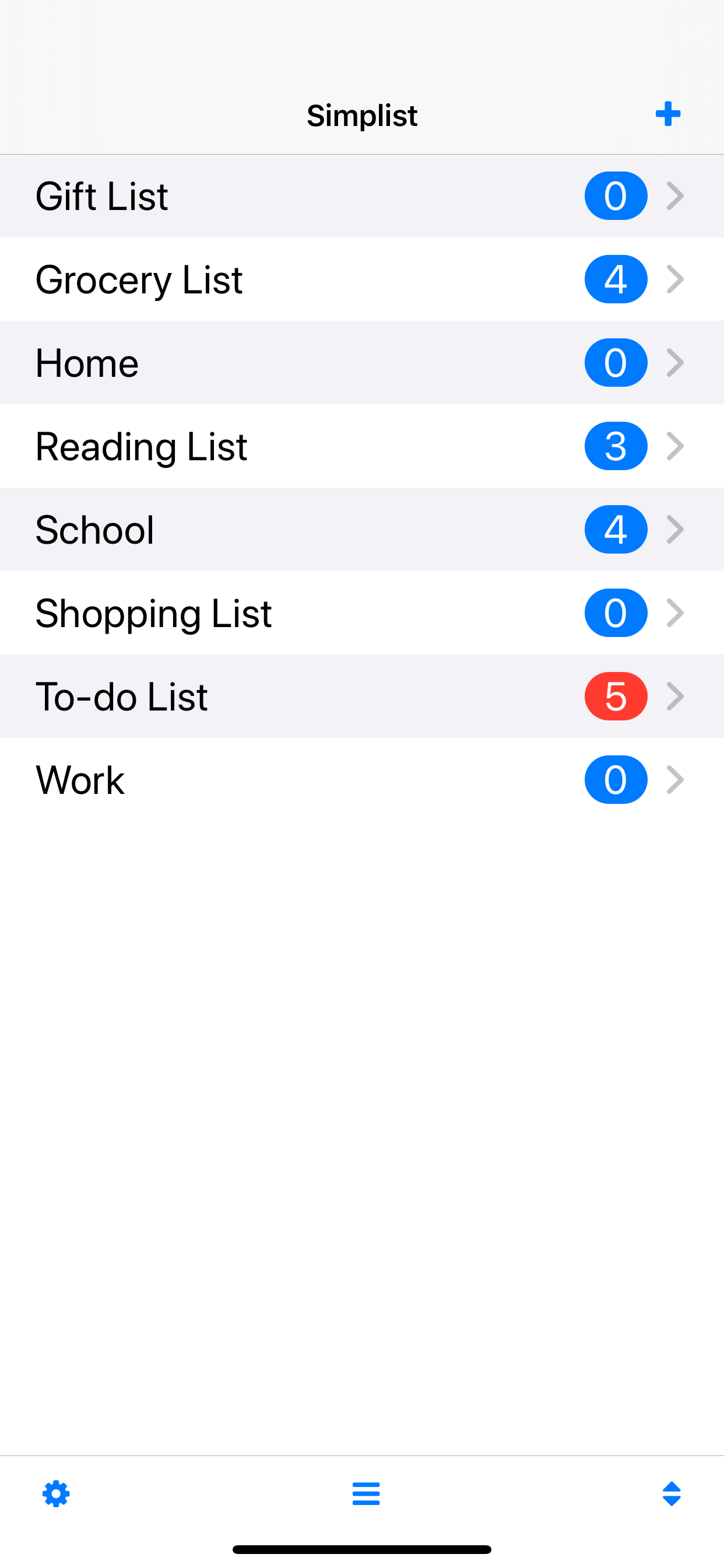
In the past, each list would display a number indicating the items that were yet to be finished/checked on the line to the far right of the title. If all items had been finished/checked, there was simply no number. It made it very easy to locate lists that still needed attention, while allowing you to retain lists (Ex. Vacation packing list) that you would use again in the future. Now, if there are no ‘unfinished’ items, a zero appears inside the blue bubble. So now I have a huge table of lists with blue bubbles all the way down the rows, making it nearly impossible to glance and see what still needs attention, especially since the font is a small and thin white number in a relatively bright blue bubble. Why on earth do you keep changing things for the sake of change when it already works perfectly? I have recommended this app to many friends and it is one of the apps I’ve had the longest, please stop changing things. Long-term users really feel these changes...


